Why Your Design's Colors Look Different on Advertising LED Screens: The Complete Color-Matching Guide
Have you ever designed an ad that looked flawless on your Mac or PC monitor, only to see it appear "blown out" or washed out once uploaded to an LED advertising screen? This is an extremely common technical issue faced by designers and advertisers alike — and it's not a design flaw so much as a fundamental difference in how the two screen types produce color.In this article, the Fast Vision team — specialists in LED screens and digital display solutions — breaks down the technical reasons behind this phenomenon and shares proven, practical steps to ensure accurate color matching before any advertising project goes live.
1. Display Pixel Technology vs. LED Pixel Pitch
Computer and Mac screens rely on microscopic pixels embedded behind a glass layer (as in IPS or OLED technology), giving them very high pixel density and smooth color gradients.Advertising LED screens, on the other hand, are made of individual emissive diodes spaced at a fixed distance known as Pixel Pitch (e.g., P2.5 or P4). This spacing means color mixing happens optically "in the air" rather than within a dense pixel grid — which is why LED colors appear brighter overall, but with a different intensity and saturation than what you see on your monitor.
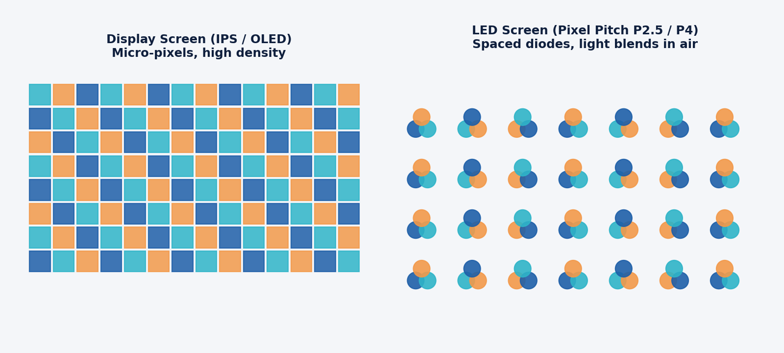
The difference between densely packed pixels behind glass (left) and spaced-out diodes on an LED screen (right)
2. Color Gamut and Display Standards
Design screens operate on wide, highly precise color spaces intended for print or desktop viewing, such as DCI-P3 or Adobe RGB.LED video processors, however, typically operate within the sRGB or Rec.709 (broadcast television standard) color space. When a design created in a wide color gamut is sent to the LED's Sending Card, the processor automatically compresses the colors (color mapping) to fit its narrower range — and that compression is exactly what causes hue shifts and color deviation.
3. High Brightness (Nits) and the Gamma Curve
Advertising LED screens are built to remain visible under direct sunlight, which is why they reach exceptionally high brightness levels:
- 1,200 nits for indoor screens
- 5,000+ nits for outdoor screens
compared to design monitors, which typically range between 300 and 500 nits.
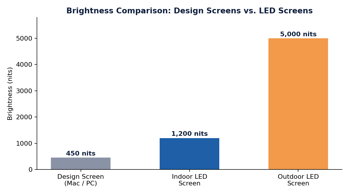
The significant brightness gap (in nits) between design screens and indoor/outdoor LED displays
This large brightness gap has two direct consequences:
- Higher brightness automatically "washes out" midtones, making them look dull on the LED screen.
- LED processors deliberately raise the gamma curve to improve detail visibility under sunlight, which shifts the balance of shadows and dark tones compared to what you see behind glass.
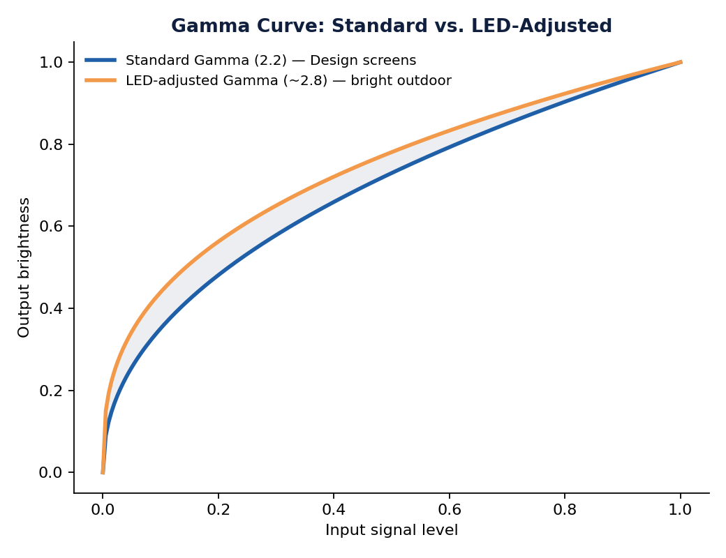
Raising the gamma curve on LED processors changes the balance of shadows and dark tones compared to the standard curve
4. Color Depth and Refresh Rate (Bit Depth)
Some budget LED control cards operate at 8-bit color depth or lower, while most design work is done on monitors that support 10-bit or even 12-bit color. This mismatch causes visible color banding in gradients, instead of the smooth transitions you see while designing.
Practical Steps to Ensure Color Accuracy on LED Screens
To avoid surprises once your content goes live on an actual LED screen, the Fast Vision team recommends the following steps:1. Set the correct color space on exportAlways export your design files using the standardized sRGB IEC61966-2.1 color space — it's the closest match to what most LED processors expect.2. Calibrate from the video processor, not just your computerDon't rely solely on adjusting brightness, contrast, and gamma from your computer. Fine-tune these settings directly within the LED control card's software as well (e.g., NovaStar, ViPlex, or Colorlight).3. Reduce saturation in your designColors that look vivid on a computer screen often appear "blown out" on LED. Reduce the saturation of bright or highly saturated colors by 10-15% during the design phase.4. Always do a live preview testBefore finalizing any project, request a live preview of part of the design on the actual LED screen so quick color adjustments can be made before full approval.
Conclusion
Color differences between a design screen and an advertising LED screen aren't a quality flaw — they're a natural result of how the two technologies handle light, brightness, and color space differently. By following the right calibration steps, you can achieve a result that closely matches what you designed on your monitor.If you're planning an LED advertising screen project and want your designs to display with the best possible color accuracy, the Fast Vision team is ready to help — from the design phase through installation and final calibration.
Frequently Asked Questions (FAQ)
Q: Why do colors look brighter on an LED screen than on my computer screen?Because LED screens can reach brightness levels exceeding 1,000 nits compared to 300-500 nits on design monitors, and their color mixing happens optically, directly between the diodes.
Q: Can the color mismatch issue be completely avoided?Not entirely, due to the fundamental technical differences between the two display types — but it can be significantly reduced through proper color space settings, saturation reduction, and processor-level calibration.
Q: What's the best color profile to use when exporting designs for LED screens?sRGB IEC61966-2.1 is recommended as the standardized profile most compatible with commercial LED video processors.
Q: Does the type of sending card affect color quality?Yes. Budget sending cards often operate at 8-bit color depth, which can cause visible color banding compared to 10-bit or 12-bit cards.